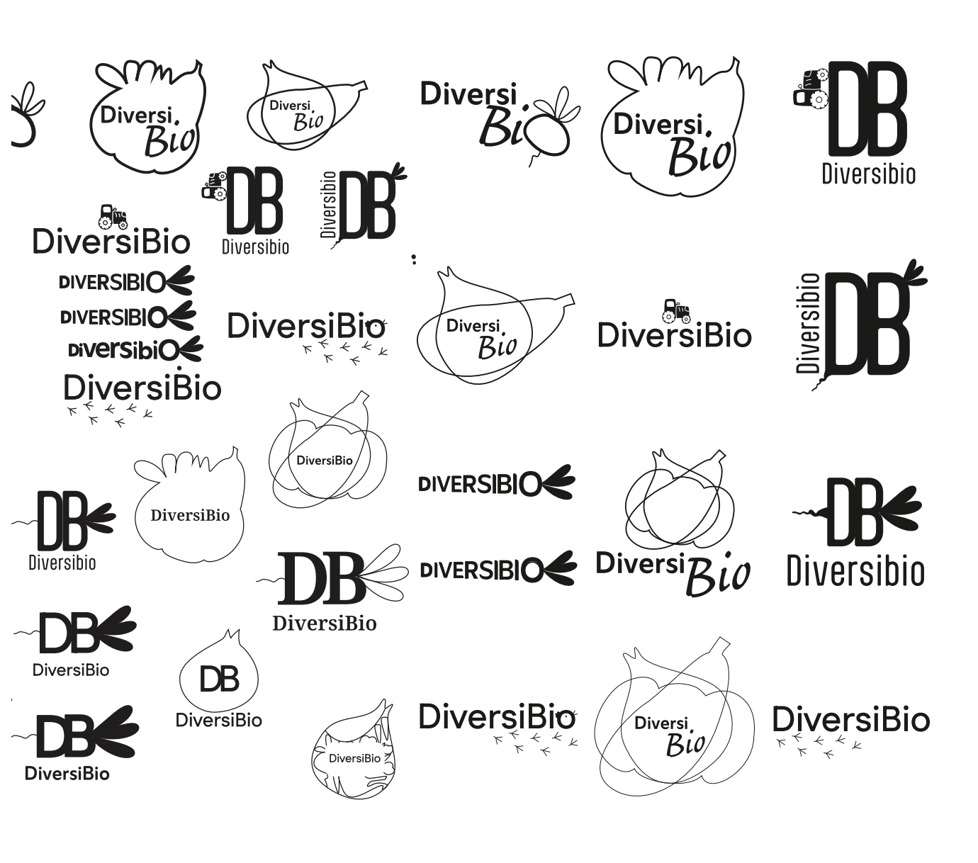
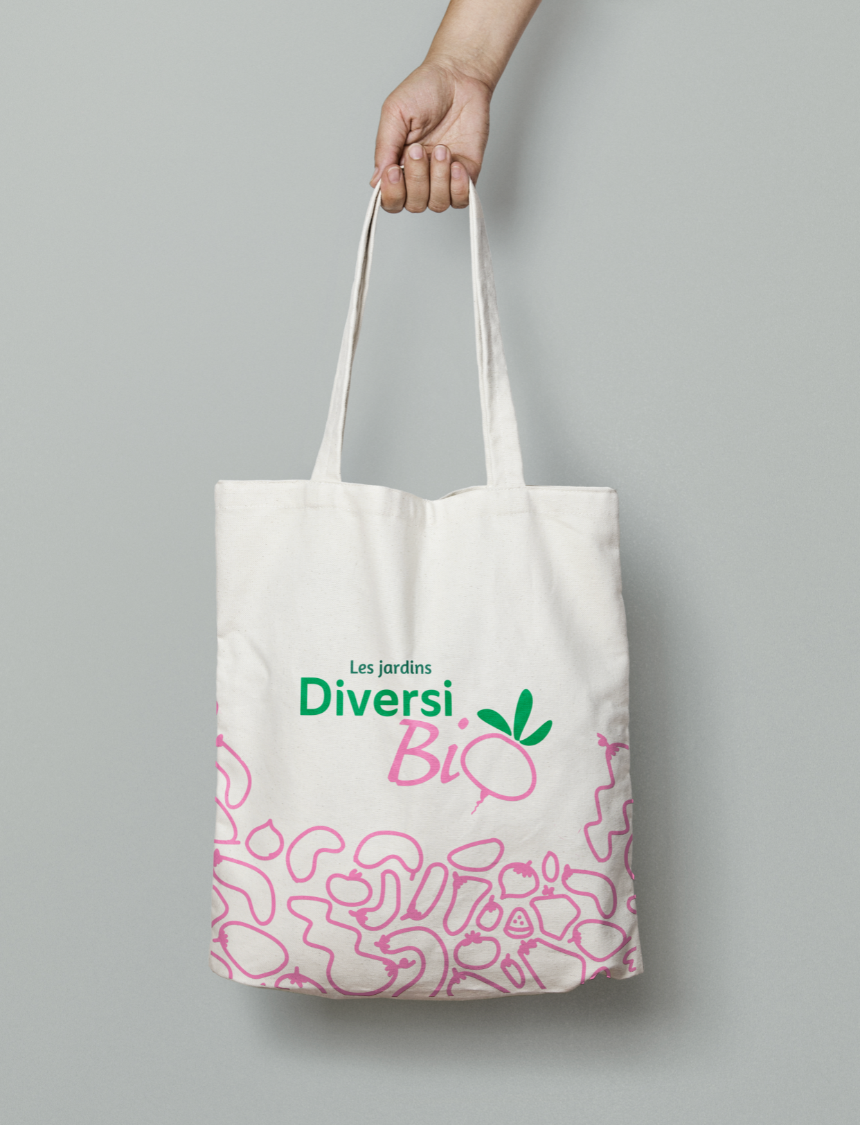
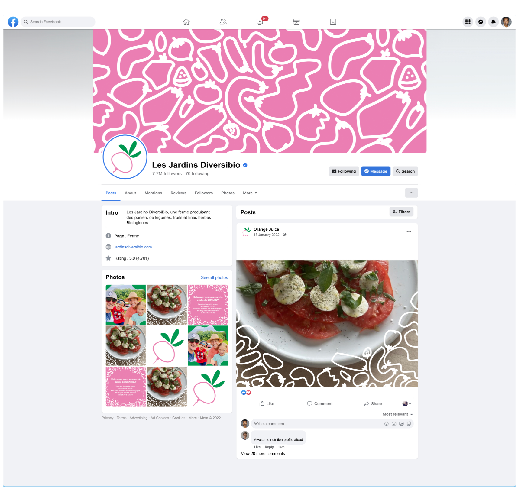
DiversiBio is a Quebec-based organic farm operating since 2003. The goal of this project was to create a refreshed and versatile brand identity, more modern and adaptable than their original one.
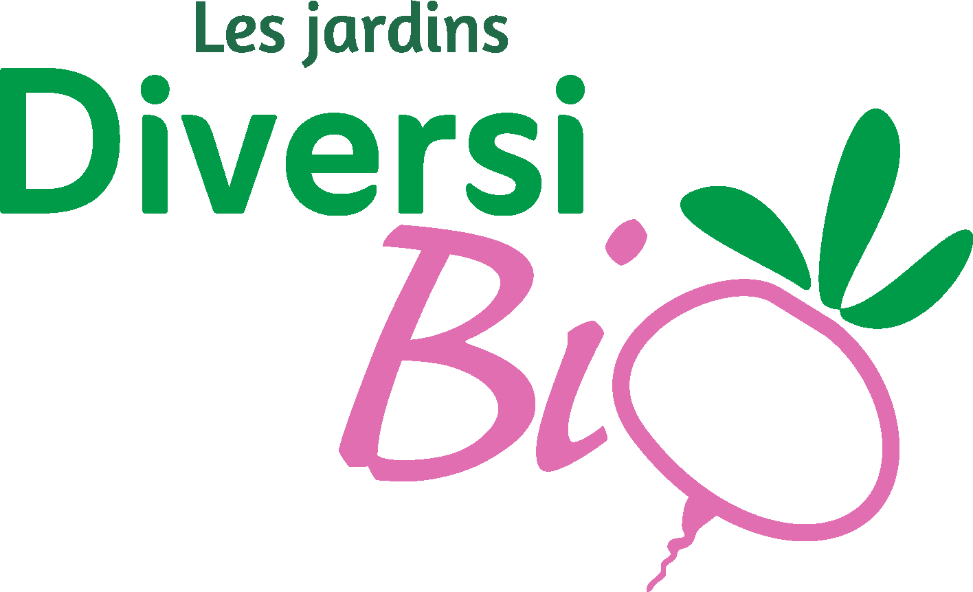
The logo features a dynamic composition with vibrant colors inspired by soil and vegetables. Two different typefaces were chosen to enhance visual energy: the first includes subtle diagonal cuts, giving it a friendly, imperfect character that echoes the natural quirks of real produce. The second, a handwritten-style font, brings a touch of authenticity.
The illustrated “O” transformed into a turnip is colorful and minimalist, slightly off-centered to better integrate with the composition. It adds a playful and lively touch that speaks to all ages.
This project was created in collaboration with DiversiBio as part of the “Brand Identity” course taught by Julie Royer.
Many differents ideas